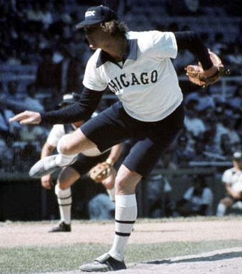
 Remember that glorious Chicago summer day in 1976 when, if you were one of the privileged few to take in a game at Comisky you witnessed your beloved White Sox trot onto the field with collared jerseys and SHORTS?
Those uniforms will go down in infamy, as will these local favorites we've had to endure over the years:
1. Mariners "Futuristic Night" in 1999. MLB's "Turn Ahead the Clock" promotion, which featured 20 big league teams wearing futuristic uniforms over the course of 14 games during the summer of '99 will be a source of uniform ridicule for years, the Mariners included. The series was actually sponsored by Century 21. Coincidentally, there's a former Century 21 marketing executive now doing infomercials for food dehydrators in Alaska.
2. Lambright's purple helmets. Talk about breaking tradition. I actually know a guy that played at UW during this era. The cool thing about being a player is you get to keep your helmet after you graduate. The shitty thing is if you're a former UW player in your early 30s, this giant grape is most likely what adorns your mantle.
3. Sonics, mid-90s. Or should they have been called the "Comics" as that's what the lettering resembled. And can anyone explain adding crimson to their color palate? Maybe they should have considered bringing it back years later, as those unis were the last to see an NBA final.
4. Seattle Thunderbirds Halloween jerseys, 2002. I can't figure out if the T-birds were trying to be clever or sell Fruit Loops with these.
5. The teal Mariners' alternate jerseys of the mid-90s. Let's face it: Teal went out with the Unit's mullet a long time ago.
6. The Purple People Eaters. Apparently in the mid-80s, UW forgot gold was the school's other color.
7. These radioactive Hawks' jerseys...if they ever see the field. Cough cough "Sounders ripoff" cough cough.
8. UW basketball, circa late-90s. I'm not so against the uniform itself, although the script "Huskies" looks a bit sissy. But the redundant "Dawgs" on the shorts was unnecessary.
9. The Hawks jerseys of the late 80s. Rude mesh. Actually, I just wanted to link a pic of the Boz.
10. The new Sonics uniforms. Weird...they got the colors, and the city name wrong?
Didn't Griffey want to design a sleeveless jersey for the M's back in the day? A uniform that everbody had to wear with their hat backward?
ReplyDeleteI hate to admit it but I was a fan of the teal M's jersey...